
Writing lab notes
An online notebook for documenting clues that help me solve the problems I’m working on.
Creative thinking, behavioural science, and narrative development with a screenwriting and product design backdrop.
Label your interfaces: The importance of words to get around and the excuses I’ve heard against using them
Text labels are simple words that tell you what a symbol or image means. For example:
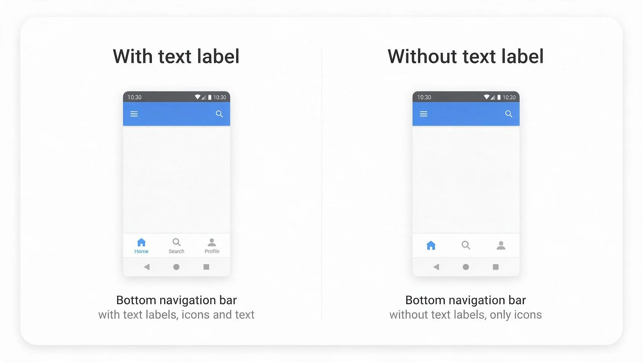
Image: Generic mobile screen featuring icons with and without labels. You can see how labels improve clarity and wayfinding. Example is generated by AI.
It’s simple common sense, for reasons. The reasons being, not everyone can understand an image, at least not in the way we expect them to.
“It’s so intuitive we don’t need to add labels.”
If an image looks familiar to you, your friends, and your development team, it doesn’t mean it will be familiar to someone else. Especially if you’re a global business.
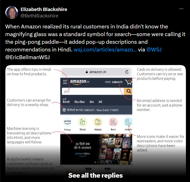
Take a look at what happened to Amazon. When they expanded to India, some of their new users thought the search icon was a ping-pong paddle. That’s just how associations work - you connect a visual to the next closest thing.
“But everyone knows this. Besides, we don’t have room for text.”
Visual metaphors will only be understood from a place of shared context and cultural background. Not every member of the same country, town, or nationality has the same cultural background.
For example, can even all humans born from the 80s onwards recognize the floppy disk? Or know that it conveys the concept of storing data when two thirds of children don’t even know what a floppy disk is.
“Nobody reads the copy.”
After a hard day of trying to improve wayfinding for users in our products, can you imagine what happened when I was met with a faceless microwave control panel. This thing made me rethink lunch (and probably revise all my life choices up until now).
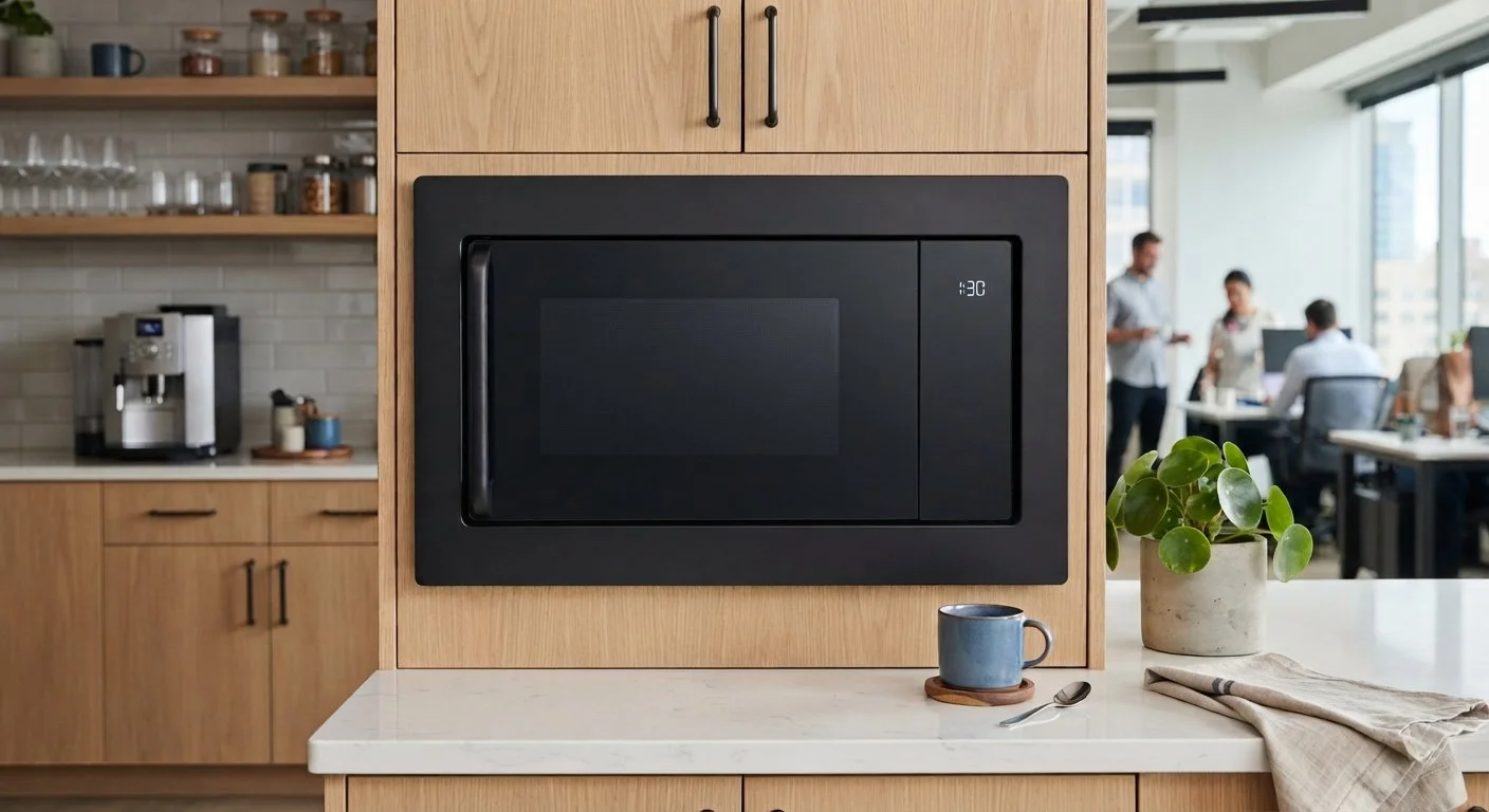
Image: Anxiety-inducing microwave. It reheats not just lunch but all your childhood dreams. It includes a button that triggers psychological trauma, a fire alarm, and a 911 call. It has no mouth, but it can scream.
It’s like watching the monolith from 2001: Space Odyssey.
I have no idea what to do. You might think, everyone knows how to use a microwave, but it’s just not true.
I might not have a microwave at home to know what to do with it. I might only know how to use the model I do have at home.
The absence of text labels on this model made me so anxious about setting my lunch on fire that I just skipped reheating.
I know it looks cool and it’s more elegant without all those pesky letters bothering the nice design you made, but if you look at the goal here: to have a practical product that’s easy to use, there’s no doubt about it:
You need clear text labels.
“Text is clutter”
You can use this rule of improving clarity by adding simple labels wherever needed:
graphs in your report
images on your web
steps in a payment flow
rooms in a floor plan
locations in a hospital map
appliance buttons and dials
the list goes on…
And you won’t be wrong. Adding informative labels won’t be a mistake, ever. Take a look at this piece of research from Orbit Media Studios. They found, among other things, using clear text labels improves how much a brand is recommended by AI tools. Talk about future-proofing your business.
Clear labels will always elevate your services and products. Let me know if you need help figuring out how.