
Lab Notes
Stuff I’m thinking about that have something to do with writing and creating.
Your brain on knowledge
I’m researching about expertise to improve my own logical and reasoning skills. That’s how I found this paper on how the brain changes while learning:
Hill NM, Schneider W. Brain Changes in the Development of Expertise: Neuroanatomical and Neurophysiological Evidence about Skill-Based Adaptations. In: Ericsson KA, Charness N, Feltovich PJ, Hoffman RR, eds. The Cambridge Handbook of Expertise and Expert Performance. Cambridge Handbooks in Psychology. Cambridge University Press; 2006:653-682.
And that’s how I picked up this marvelous brain scan that shows you the difference between how hard a beginner has to work to learn something new and how effortlessly a master practices their craft, from the same paper:
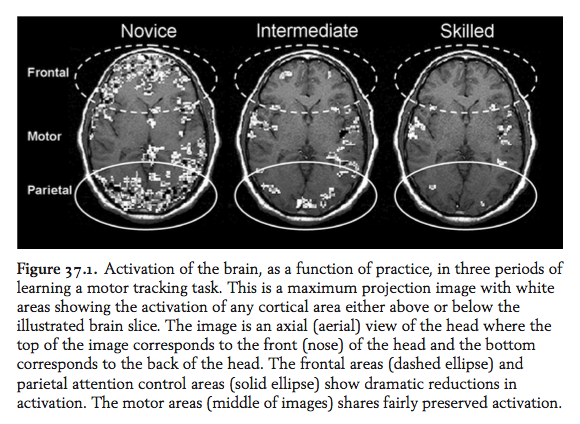
Naturally, beginners are at capacity, or easily overwhelmed. This is what interface writers and designers know all too well – how hard it is for people to experience something new. The reason why you have to design an experience.
And the experts? They’re not overloaded. They have the breadth and space to think strategically while they pull up their know-how.
Remember this comparison. In a real-world setting, this is the difference between dabbling and making an educated guess that wins against what everyone else thinks is going to happen.
Read the full paper:

The unexpected danger of a dialog confirmation
Of all the interface components I’ve worked with, dialogs are the most intimidating. They might look like a simple box, but they are hard to get right.
For the uninitiated, dialogs are UI components meant to make sure users mean to do what the system thinks they want to do. It’s a layer of confirmation. You can use them to collect inputs as well. See this example from Balzamiq:
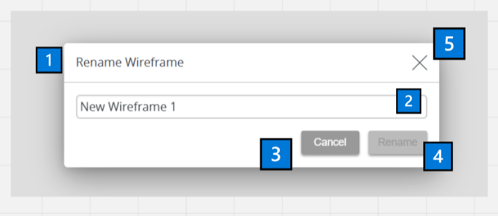
Dialog screenshot from Balzamiq. Action is renaming wireframe.
What a dialog is made of:
Title
Some content or more components/inputs.
Secondary button. This one’s the “I made a mistake, please go away,” command.
Primary button. This one will confirm the action you started with. You’re basically agreeing to something that you set in motion. “Yeah, I really want to do this. Let’s take that red pill.”
Close button. Another way to make the dialog go away if you feel uncertain about what the buttons actually do.
Now that you’ve had the crash course, I’m curious to see what you think about a dialog I encountered in the wild…
I’ve started to play Civilization VI for the first time. Naturally, I don’t know the law of the land. So when I try to move my unit into a strangely colored field, I trip up over this:
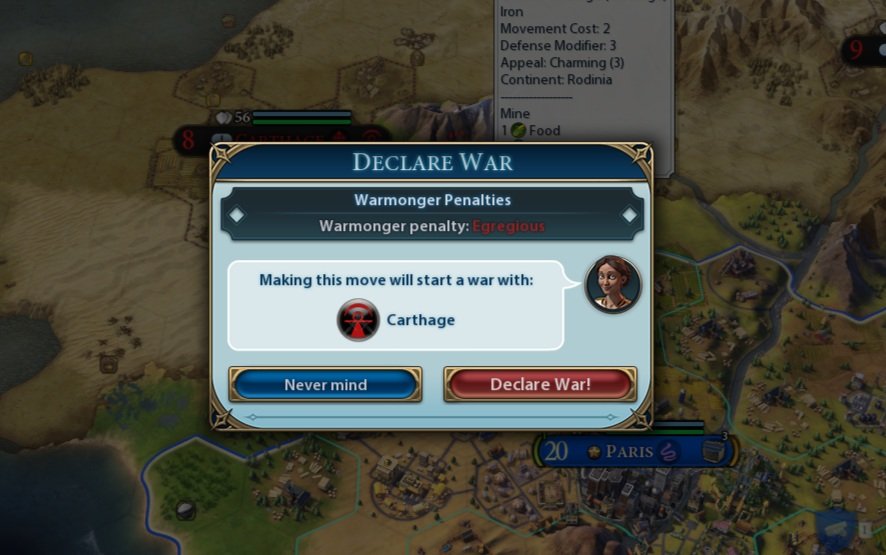
Screenshot from Civilization VI
Umm, what now?
I knew I didn’t want to declare war, but I was confused as to what to do next. What I wanted to do was cancel. My thinking was:
Blue button reads: “Never mind, I can start the war”
Don’t want to start a war by accident.
I couldn’t rely on button position as different systems place secondary and primary buttons in a different spot.
I could not exit the dialog without making the choice (no close button).
Is the question asked about declaring a war or about making a move?
Relying on colors was tricky. Due to my work in UX I read red as danger.
Is the red button here really dangerous or is it just, you know… the color of war?
Basically I was overthinking it. That just shows you how easy it is for a dialog to surprise you.
Holding my breath, I clicked the “Never mind” button and it behaved like a normal “Cancel”. What a relief.
To improve the dialog, I’d use “Cancel” for the secondary button in this particular case. Another option would be to add context (maybe “Cancel the move”). That would feel safe.
I love creative button labels, especially in games. Definitely wrote a lot of those myself. But there is more leeway to be creative with button labels when you’re writing a game where choice is a dialog mechanic (visual novels, RPGs…) or in general UI when only a single button is displayed so nothing is left unclear, there’s no actual choice to make.
Anyways, the game is awesome, I’m really enjoying it. I've established a religion called The Church of the Witch so you know I’m having fun battling the Spanish Inquisition.

Thinking of using all caps or uppercase formatting in a title? Read this first.
A small use case breakdown about using uppercase versus sentence case on an example of two finance apps.
Usually the discussions I’ve been in focus on title case versus sentence case, so having uppercase in the mix is new to me, but this other day I was shopping and my finance app blasted me with an uppercase title.
I was horrified.
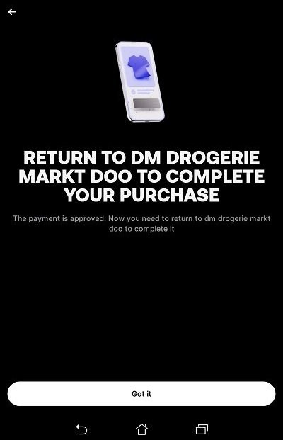
Payment confirmation screen from Revolut
I’m kinda bothered by this. One reason is, this is harder to read and/or slower to comprehend. See for yourself:

Side by side comparison of the different cases
Second reason. When I first saw this, I thought I was on Wise. I literally felt like I’ve closed one app and opened another.
Can you tell why?
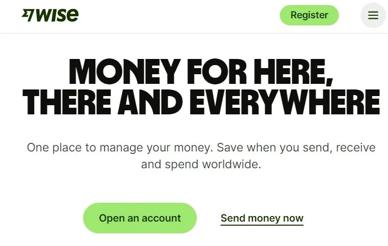
Wise.com webpage
Even if Wise is using a big bold heading at the beginning of their website, it feels like making an impression rather than yelling, especially due to keeping the word count sane and complimenting the experience with a calming white and green color scheme. As a user, I’m not in a payment flow, I’m browsing around and have the time to focus here.
And the moment you travel down the page, the headings switch to the more easy to read sentence case:

Wise.com webpage
Wise has made a decision to be bold, but mindful of where, when, and why, while protecting their readability. Can you imagine if someone decided to just match the main heading and put everything in all caps?
The lesson here?
An uppercase title can work very well for your brand if you know how to use it and why. If you’re just copying something you think will become a new standard, it’s better to play it safe until you get a better idea of what you want to do.