Thinking of using all caps or uppercase formatting in a title? Read this first.
Usually the discussions I’ve been in focus on title case versus sentence case, so having uppercase in the mix is new to me, but this other day I was shopping and my finance app blasted me with an uppercase title.
I was horrified.

Payment confirmation screen from Revolut
I’m kinda bothered by this. One reason is, this is harder to read and/or slower to comprehend. See for yourself:

Side by side comparison of the different cases
Second reason. When I first saw this, I thought I was on Wise. I literally felt like I’ve closed one app and opened another.
Can you tell why?
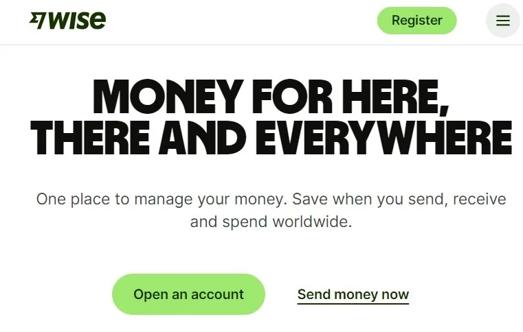
Wise.com webpage
Even if Wise is using a big bold heading at the beginning of their website, it feels like making an impression rather than yelling, especially due to keeping the word count sane and complimenting the experience with a calming white and green color scheme. As a user, I’m not in a payment flow, I’m browsing around and have the time to focus here.
And the moment you travel down the page, the headings switch to the more easy to read sentence case:

Wise.com webpage
Wise has made a decision to be bold, but mindful of where, when, and why, while protecting their readability. Can you imagine if someone decided to just match the main heading and put everything in all caps?
The lesson here?
An uppercase title can work very well for your brand if you know how to use it and why. If you’re just copying something you think will become a new standard, it’s better to play it safe until you get a better idea of what you want to do.